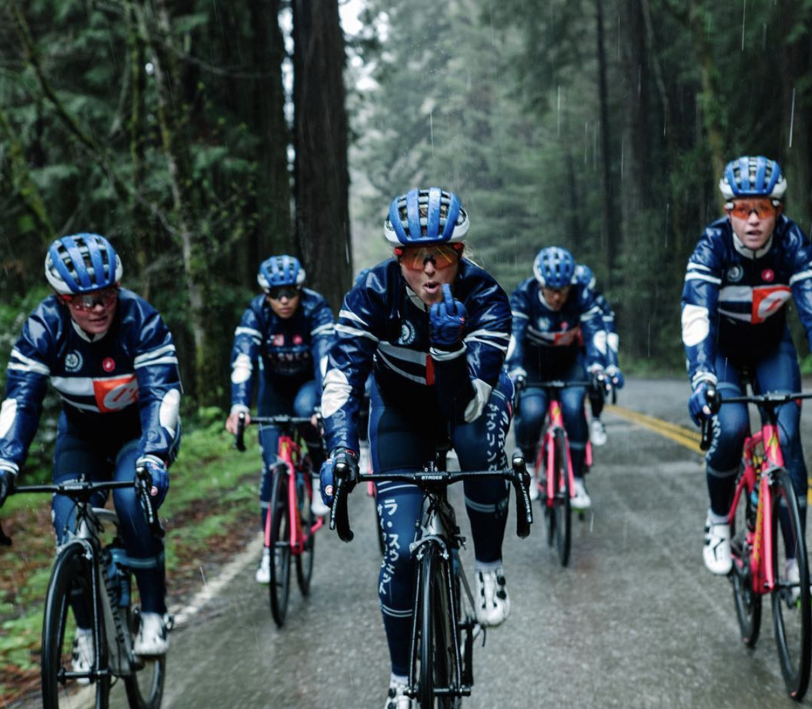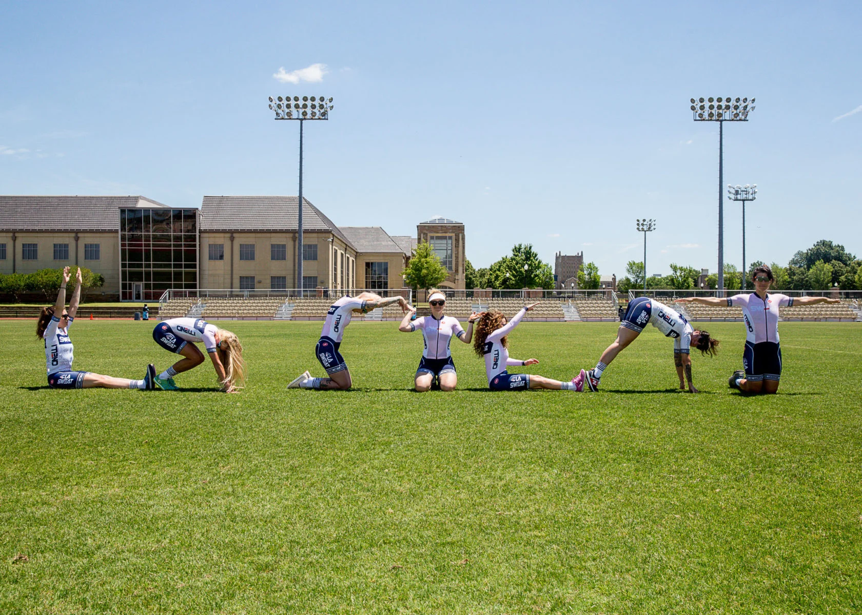
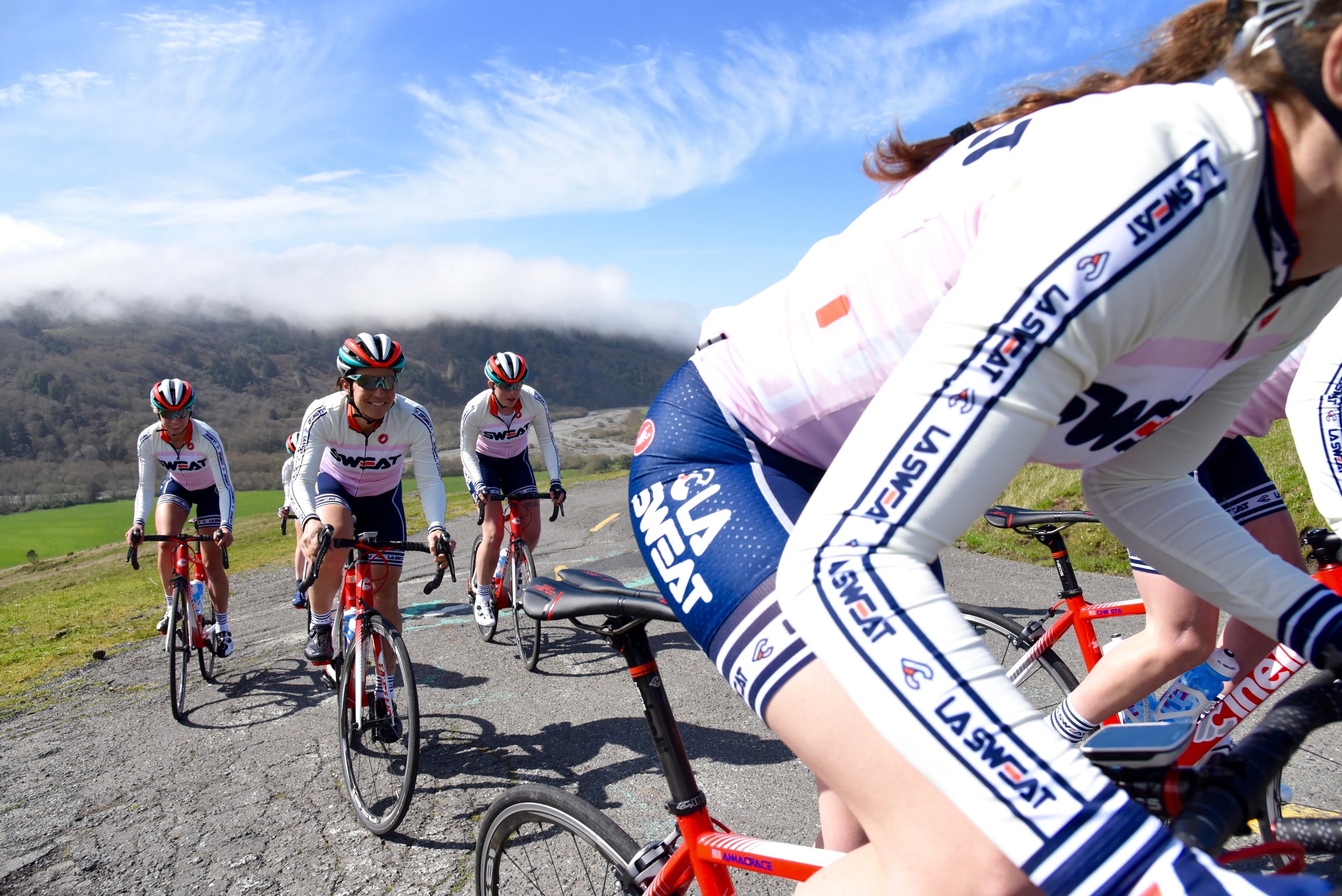
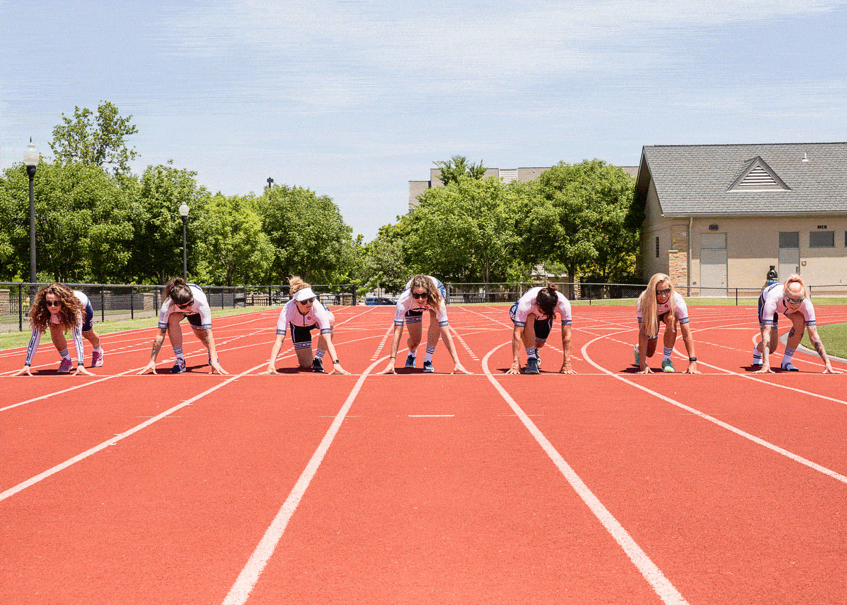
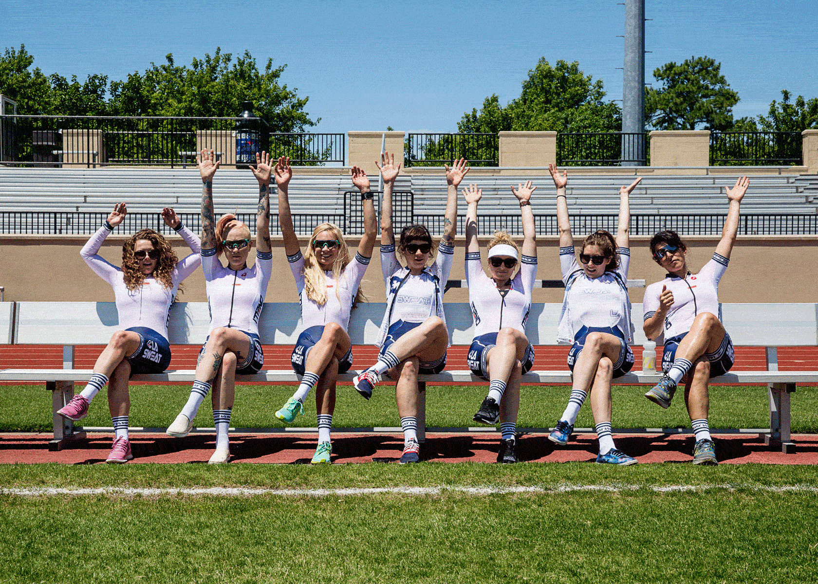
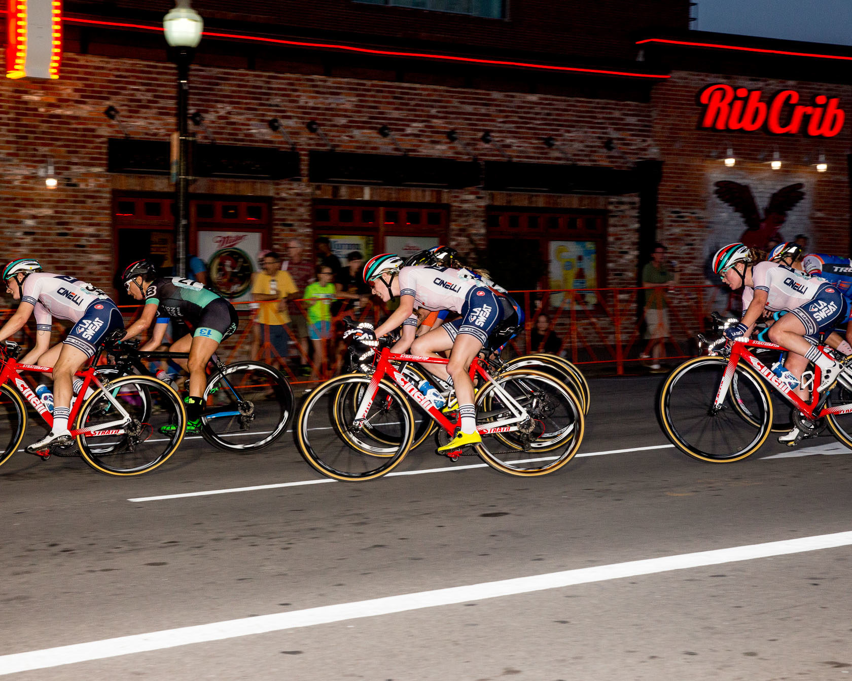
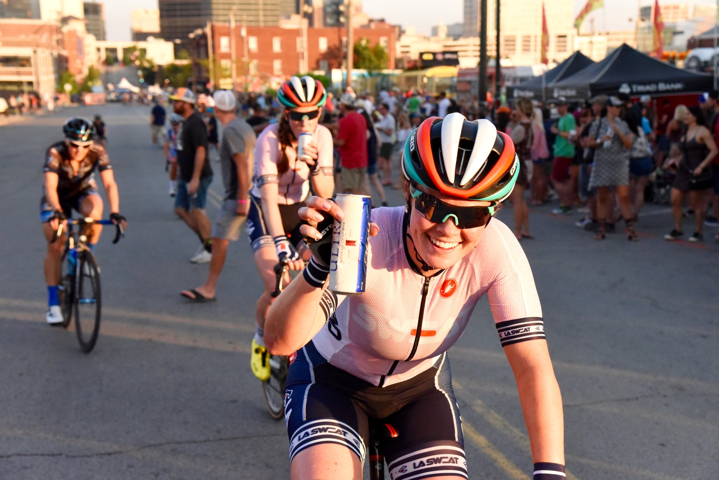
LA SWEAT
Founded in 2015 by Kelli Samuelson, I have had the opportunity each year to to design the overall look, feel and tone of voice for the La Sweat cycling team. This includes full kit/uniform design, website refresh, messaging and iconography.
Each year I try to start completely from scratch to design a unique uniform for the riders that blends sport with fashion, proving that it is possible to be feminine and strong as hell.
Below is a look back at each year's design.
You can also visit the La Sweat Website to see more.
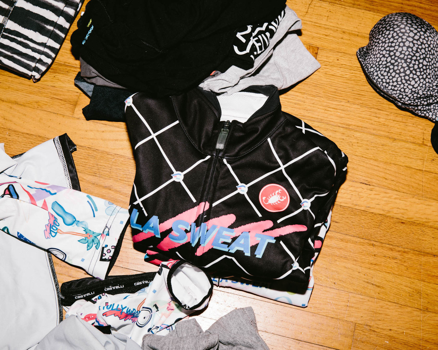
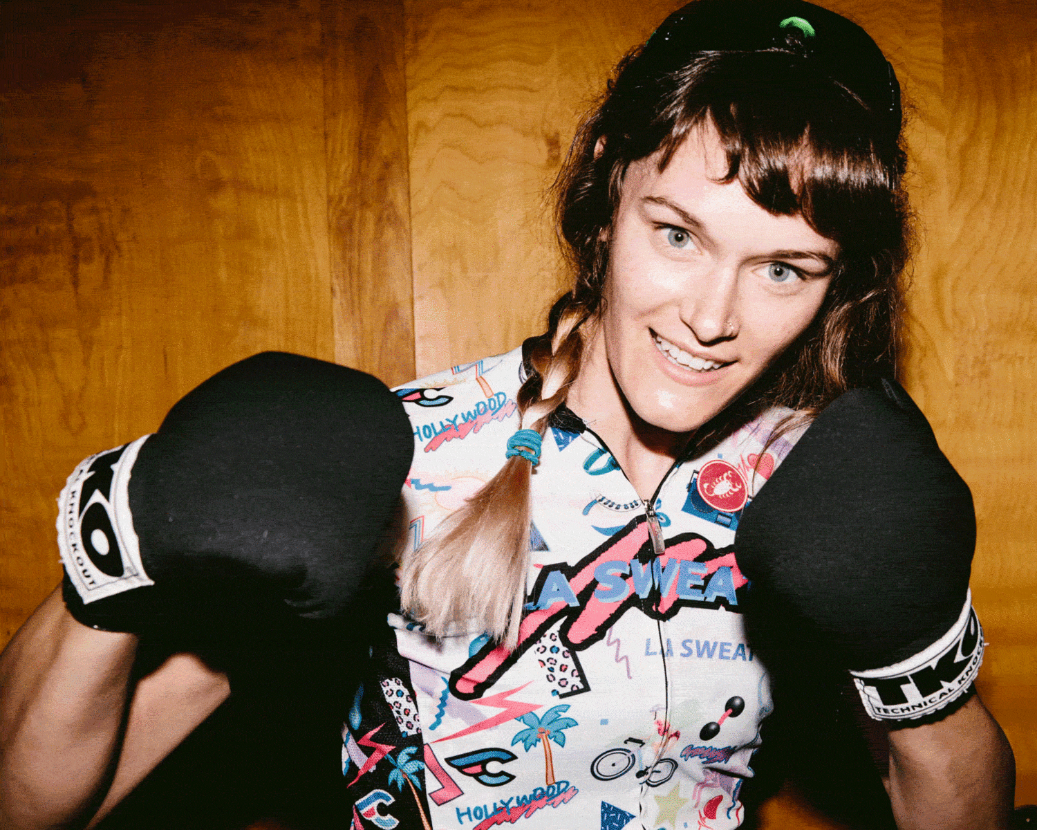
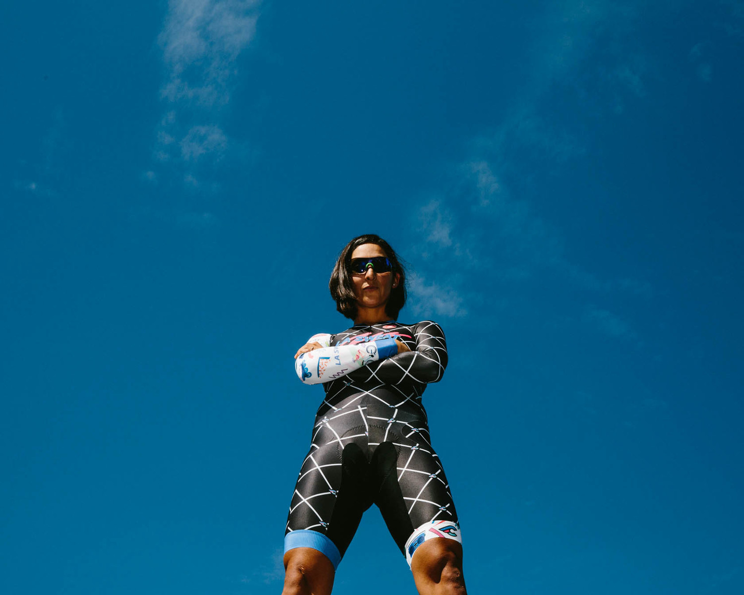
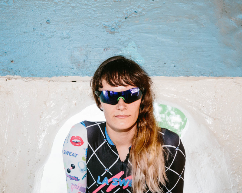
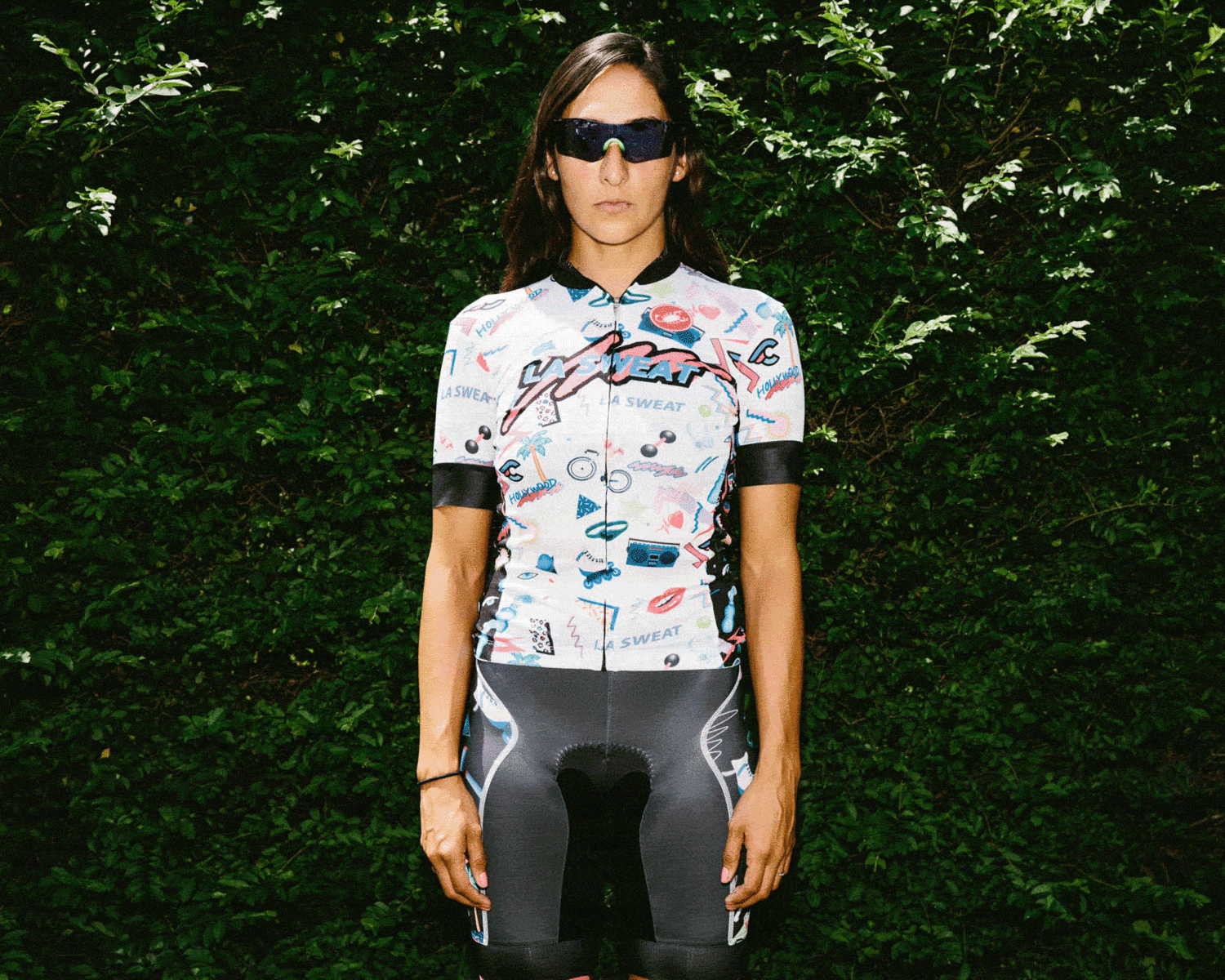
YEAR 1: 2015
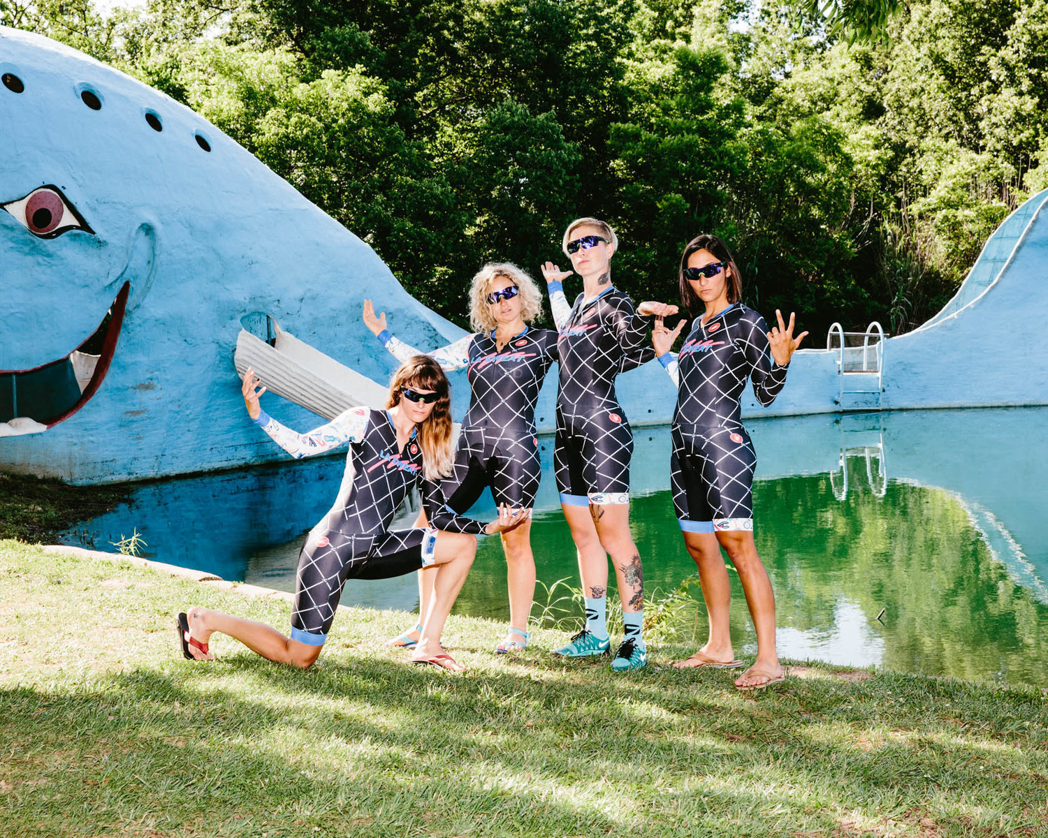
We worked with artist Yoko Honda to create a 90's pattern to be used on the jersey and shorts.
The skinsuit designed used a diagnol grid pattern, manipulated Cinelli logo and Honda's print.


YEAR 2: 2016
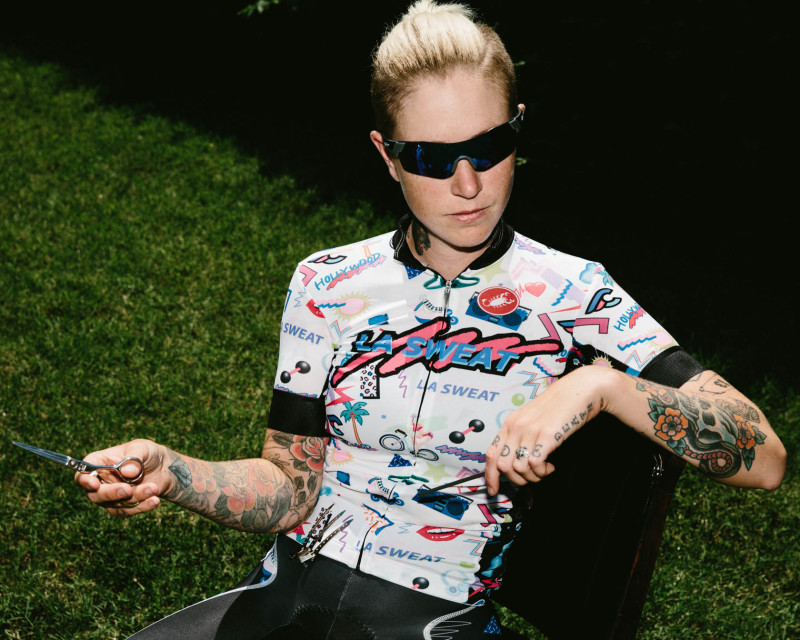
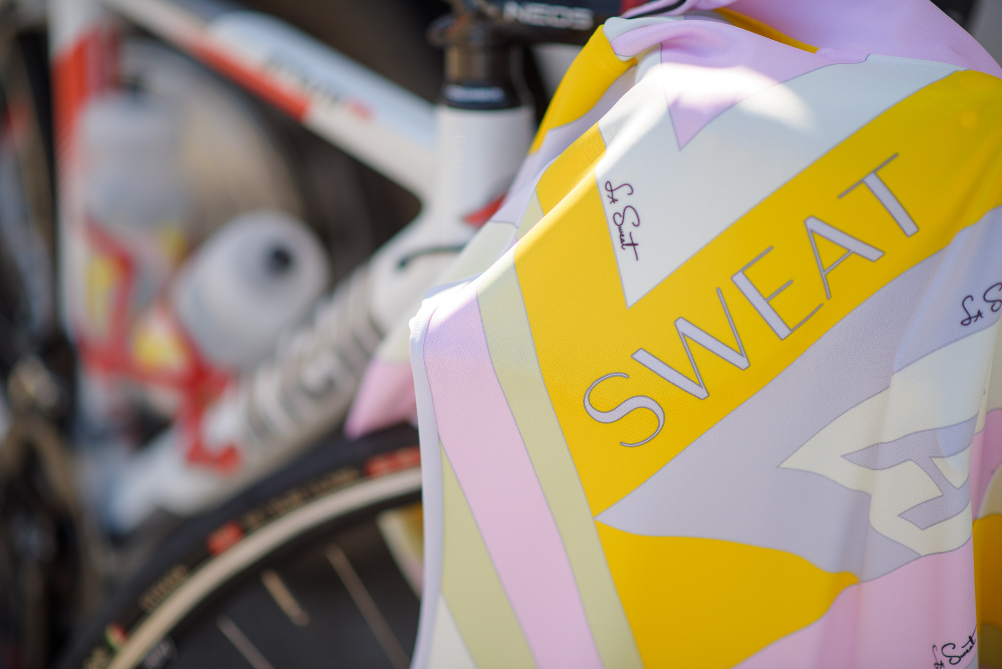
Moving away from the 90's workout vibe I wanted to design a kit that was sporty but elegant. Think cycling meets Beverly Hills. It was an effort to prove that "you can be feminine and strong as hell." Which became the team motto. I commissioned Alex Ostroy to work his illustrating magic to make a kit inspired by Chanel, Versace and Pucci.
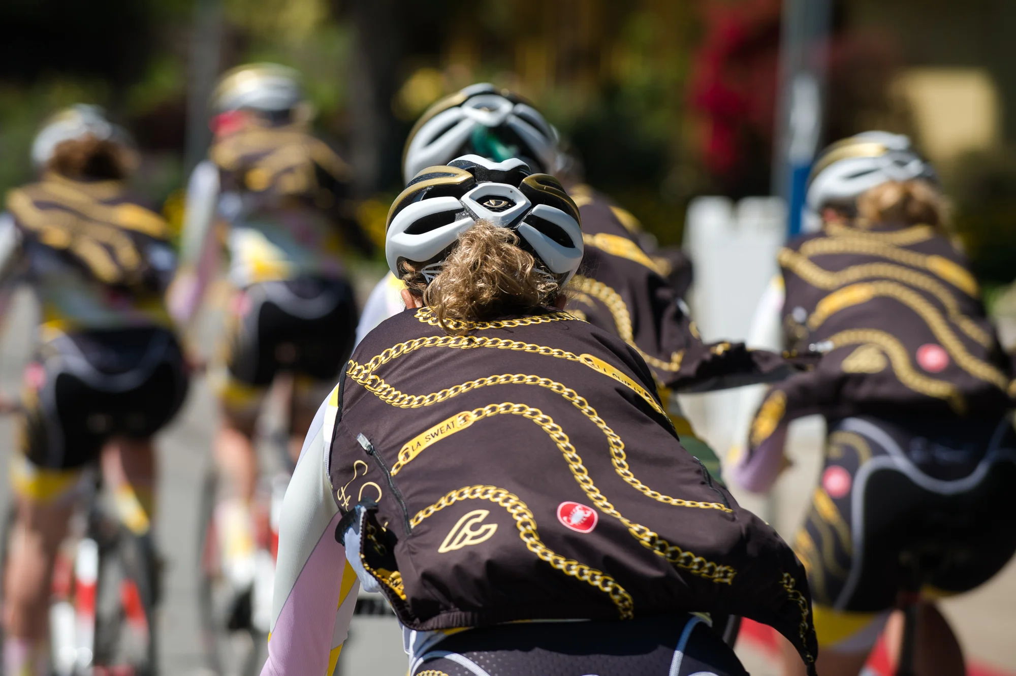


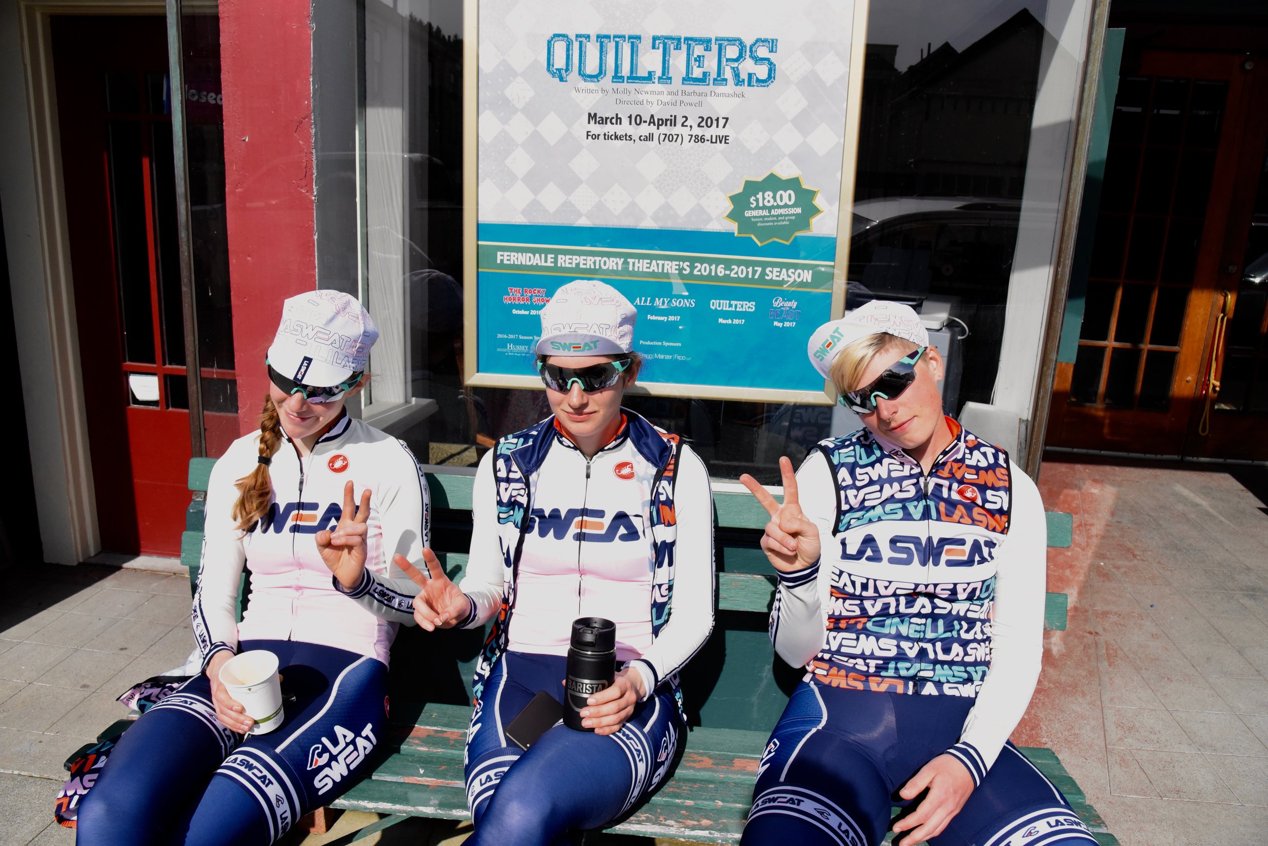
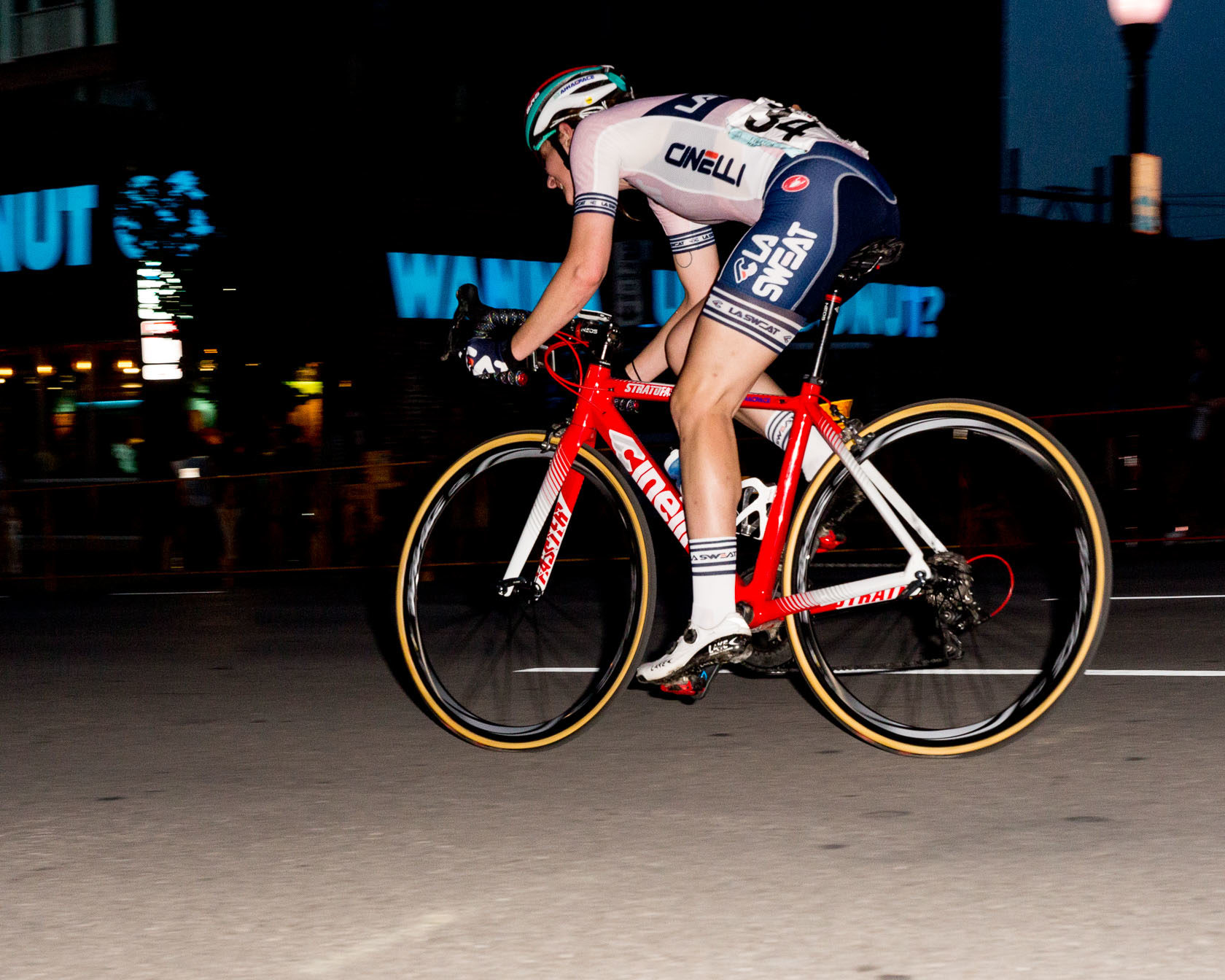
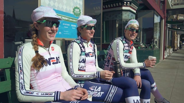
YEAR 3: 2017
Switching back to sporty, the inspiration for 2017's kit is blatant. It's a throwback to FILA with an overtly feminine flair.


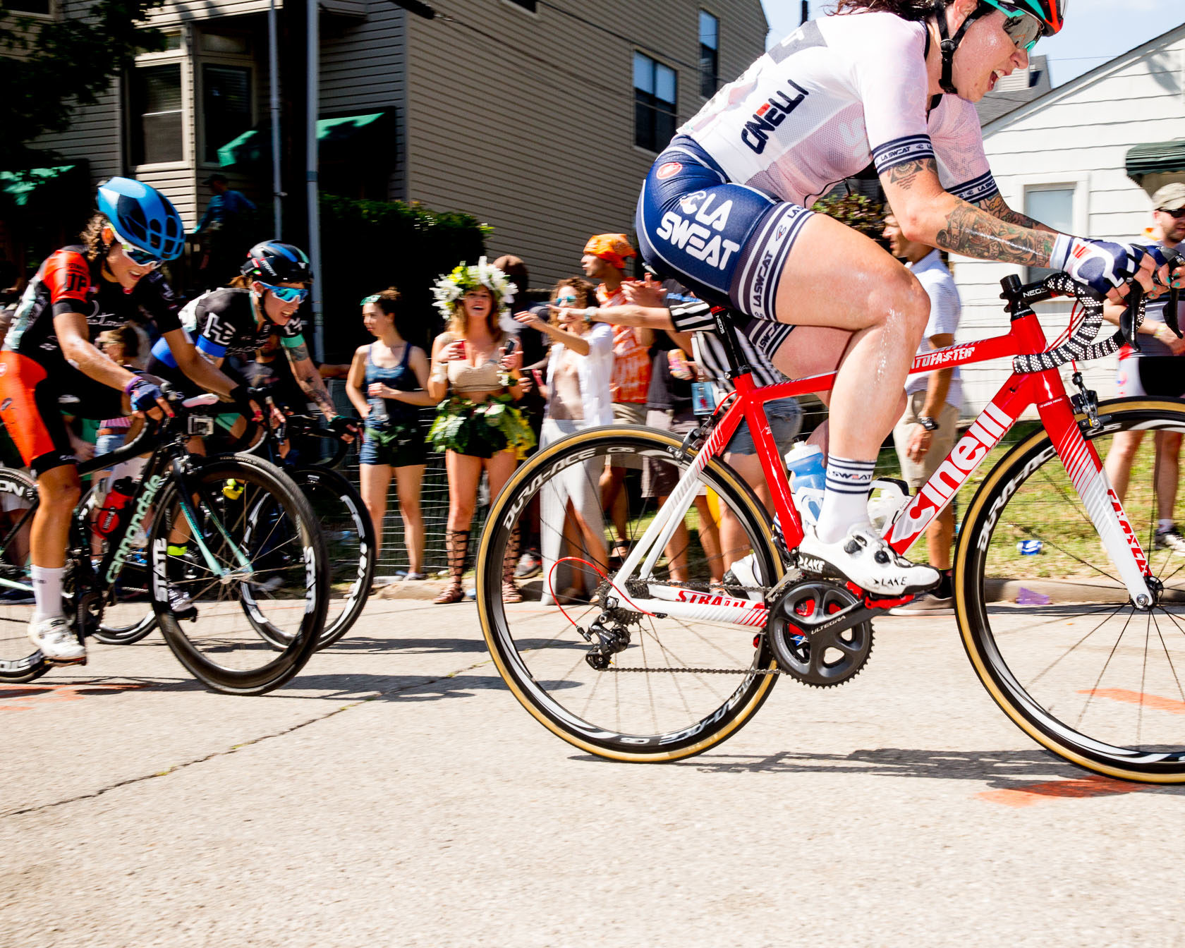
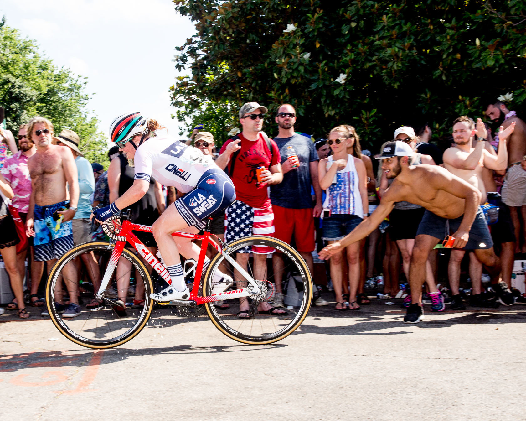
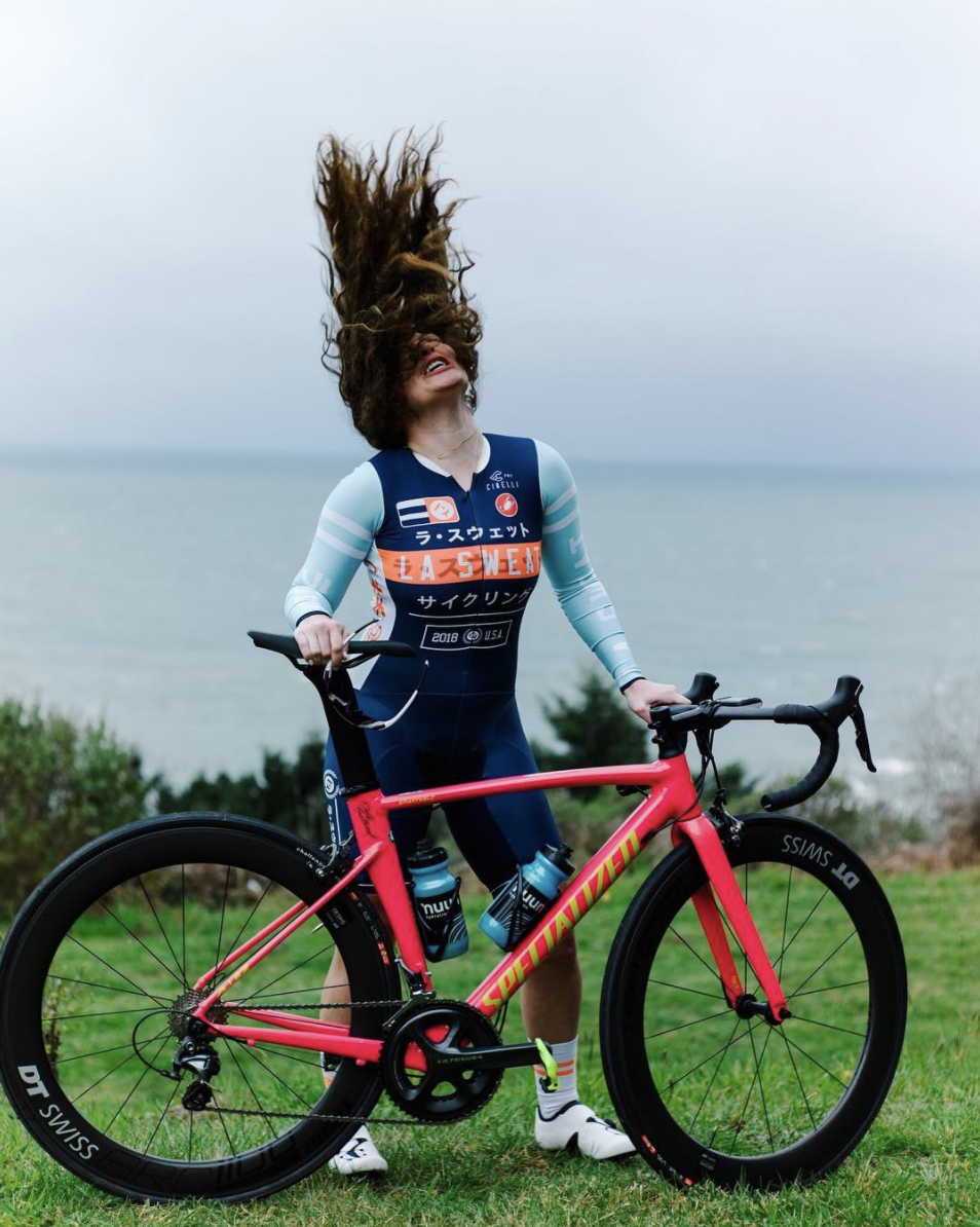
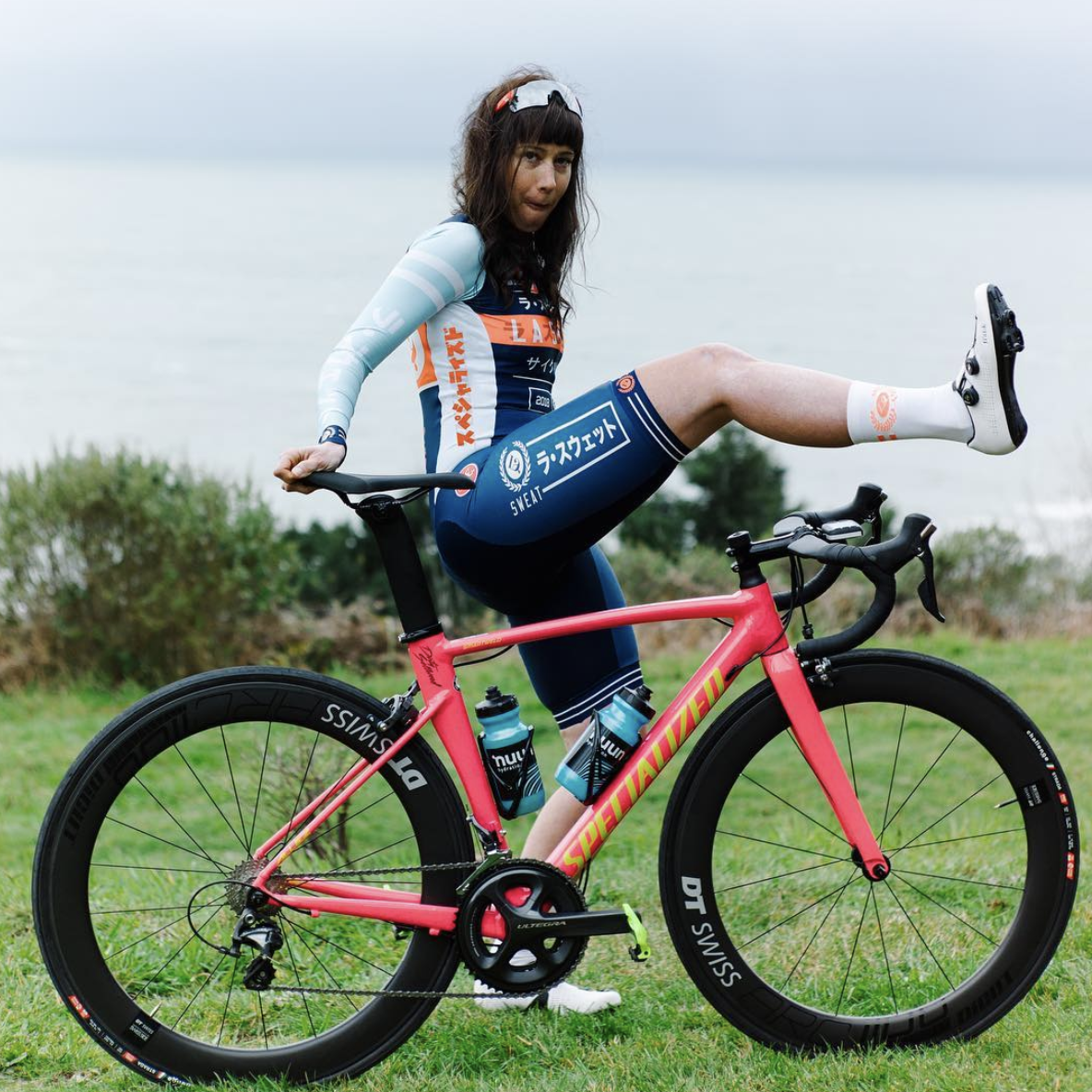
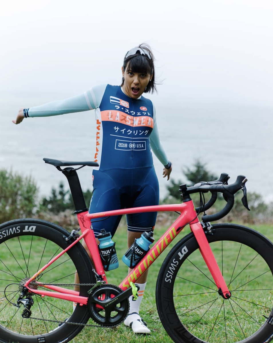
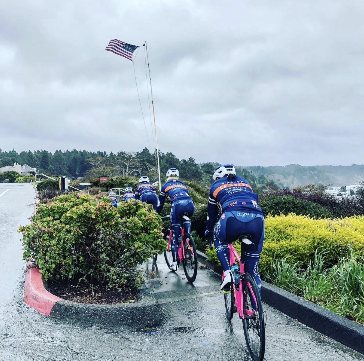
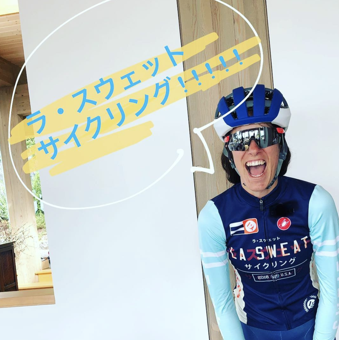
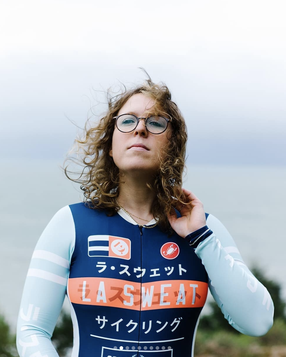
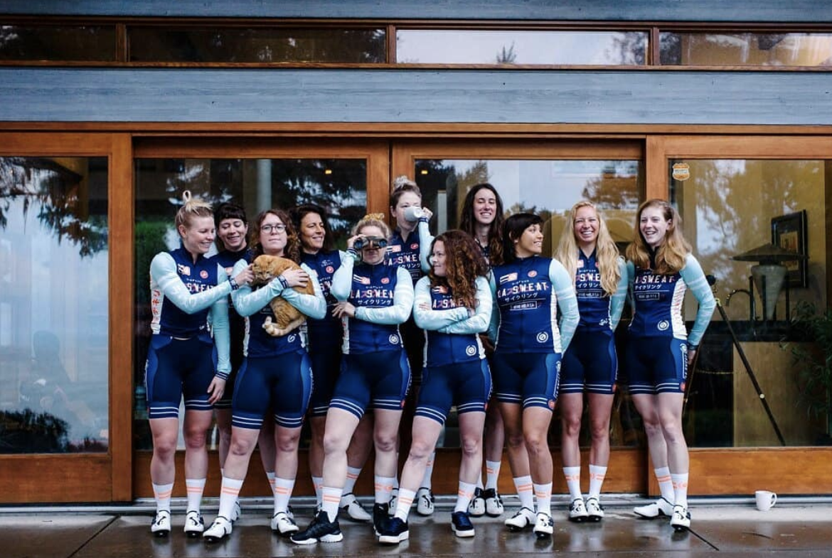
YEAR 4: 2018
My mild obsession with high-end sportswear collided with the looming 2020 Tokyo Olympics in the 2018 kit. It uses the beautiful aesthetic of the Japanese language, and writes La Sweat Cycling in the katakana alphabet to write ラ・スウェット サイクリング which translates to La Sweat Cycling. The two are used interchangeabley and ghosted upon each other. Also in Katakana is our bike sponsor Specialized/スペシャライズド